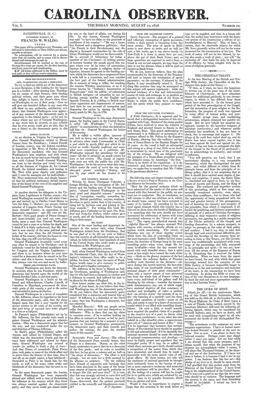
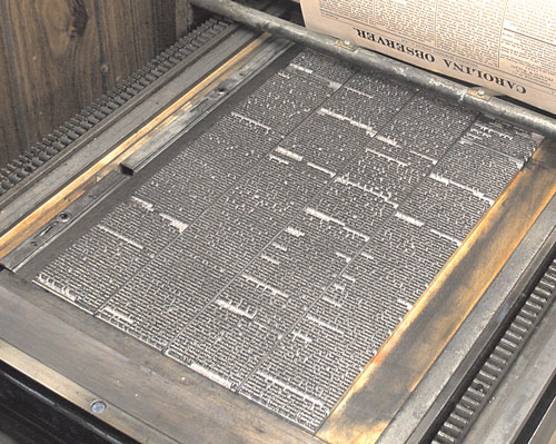
Significant changes in typesetting had occurred since the Revolutionary War and in the English language in general, for around 1800 the now-strange-appearing long s and its associated ligatures were dropped from the alphabet both in the U. S. and in England. Likewise, the traditional oldstyle type designs of William Caslon had gone out of vogue in favor of so-called “modern romans” with their greater contrast between thick and thin strokes, and finer serifs. Thus, we find the Carolina Observer decked out in a modern roman typeface (although it still retained some eccentricities of older designs). This is especially evident in the swash italic capitals A, M, W, Y, N, etc.
Punctuation Style of That Era
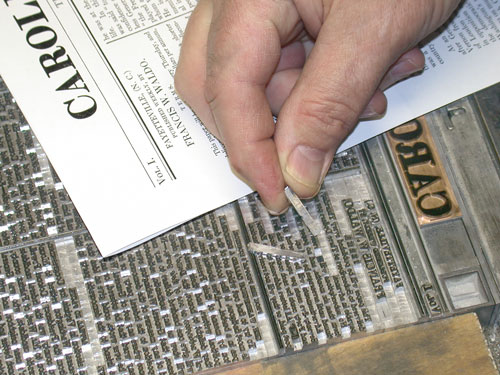
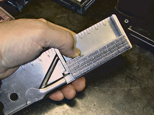
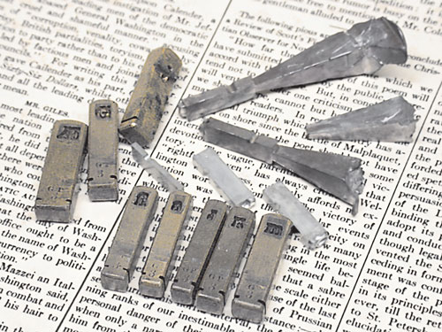
Compared with modern practices, there were significant differences in procedures for punctuation. Back then they “double-spaced” after a period, a colon or a semi-colon. Remnants of this now-obsolete style remained into modern times especially with typewriter instruction in the late 20th century. Another obsolete “style” was the insertion of extra spacing before the colon, the semi-colon, the excalamation mark and the question mark. And finally, it was “style” to put space between quotation marks and the words they enclosed. Fortunately, I was able to modify my Monotype matrix case and keyboard in a way to mimic all of these obsolete procedures and thus, match in a very precise fashion the original document. Oh yes, the Monotype also allows usage of small capitals, which were utilized throughout the Carolina Observer as subheadings.


