Declaration of Independence By Mary K. Goddard Includes Names of Signers

Printing of the U. S. Declaration of Independence has a fascinating background. It involved several of the printers of the Colonial era. The first was John Dunlap, who was commissioned to print the document immediately after it was approved July 4, 1776.

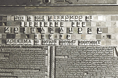
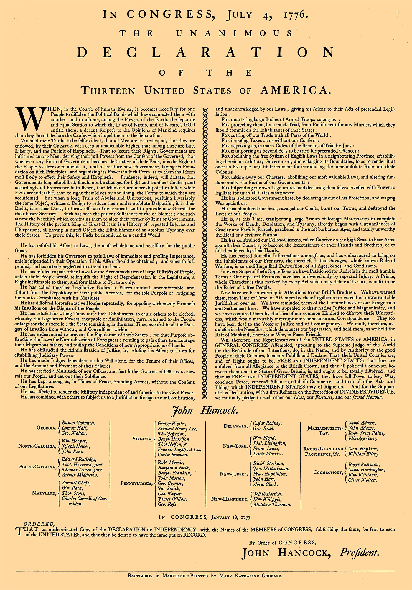
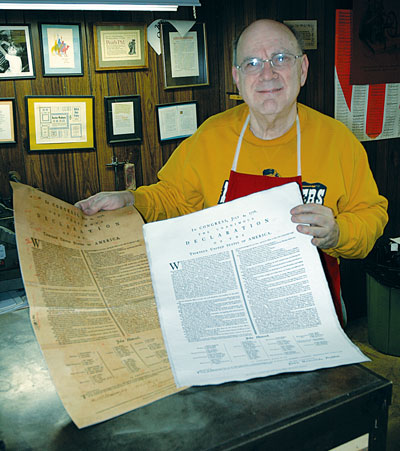
Dunlap’s printing is the most frequently displayed document and for good reason: it was the first public release of the resolution after it was approved by the Continental Congress. Copies of this printed document were taken back to the home states of the various delegates. This may have been the document handed to King George III notifying him of the resolution to break all ties with Great Britain, but this fact cannot be confirmed. The Dunlap edition served as “copy” for newspaper printers as it was brought to them by their delegates; it had to be set up by hand at each printing shop, for there was no other way of doing things back then. Certainly these facts are reason enough for the Dunlap edition to be used in historic printing shops emulating the Colonial period.

Rich at the Composition Caster, used to cast the main body of the Goddard Declaration.

It must be noted that the New York delegation was specifically prohibited from signing any document approved by Congress until such time as the State Legislature itself could read and approve the document. That approval did come—just 15 days afterwards, on July 19, 1776. Learning of this approval, the word “Unanimous” could be added to the document. It was at this time Congress approved the Declaration be “fairly engrossed on parchment, with the title and stile [sic] of ‘The unanimous declaration of the thirteen United States of America,’ and that the same, when engrossed, be signed by every member of Congress.”

Timothy Matlack, a Pennsylvanian who had assisted the Secretary of the Congress, Charles Thomson, prepared the official document in a large, clear hand. Matlack was also the “scribe” who wrote out George Washington’s commission as commanding general of the Continental Army, which also was signed by President John Hancock. Finally on August 2, 1776, the journal of the Continental Congress record reports: “The declaration of independency being engrossed and compared at the table was signed.” This contradicts the popular belief that the signed Declaration was completed July 4, 1776, with the signatures of all the delegates in attendance. This sequence of events reveals that the Dunlap printing pre-dates the hand-inscribed, signed document by nearly a month.

The Continental Congress had fled to Baltimore, Maryland, due to mounting British victories. There it re-convened December 20, 1776, and stayed in session until March 4, 1777. On January 18, 1777, after victories at Trenton and Princeton, John Hancock’s Congress ordered a true copy of the Declaration of Independence printed to include the names of all the signers. Mary Katharine Goddard, a Baltimore postmistress, printer and publisher, was given the original engrossed copy of the Declaration to set the type in her shop. A copy of the Goddard printing was ordered to be sent to each state so the people would know the names of the signers.

Dunlap is thought to have printed only about 300 copies of his document and of that press run, 26 copies have survived. Certainly more copies were printed by Goddard because of the planned distribution, yet only nine copies have survived. It was easy to get a visual representation of the Goddard document off the Internet. But no Internet discussion had an accurate statement as to the physical size of the type form. Invariably, sizes given relate to the size of the entire sheet, which varies from copy to copy because over the years for whatever reasons, the wide outer margins have been cut away. I had no specific dimensions for the type form until Karl Schaffenburg, a national park ranger and member of the staff at the Franklin Court Printing Office, gained access to an original held at the Library Company of Philadelphia. He provided me with specific measurements in picas, which enabled me to match sizes as closely as possible. From Internet files, I generated a digital proof to these precise dimensions and used it to guide my selection of type sizes, leading, and spacing. Though it was printed from a high-resolution file, it still was fuzzy. Thus, I could not be certain that all sizes of the type which Goddard used were of the Caslon design. The body type appeares more condensed, but that appearance might be the result of paper shrinkage, distorted photoduplication, or digital morphing. The display sizes certainly looked as if they are Caslon’s design.

My goal was to reproduce the Goddard document as accurately as possible with regard to type size, line length, line endings, word spacing, and vertical spacing. And of course I had to use the full alphabet in vogue in the 18th century—including the long s, its eight ligatures (si sl, ss, ssi ssl, sb, sk, sh), the tied character ct, all the standard f ligatures (fi, fl, ff, ffi, ffl), and the diphthongs (Æ, OE, æ, oe). I have these matrices only for Caslon, so consternation over whether Goddard really used Caslon types was useless. I know of no other Colonial-era typeface based on Dutch models (which preceded Caslon) ever being replicated in metal, so it was “use Caslon or don’t do the job!”

With the aid of tweezers, Rich makes minor corrections in type before being assembled into the larger form.

In reproducing the names of the various signators to the document, Goddard abbreviated as did the signors; she fabricated a smaller, superior letter for those abbreviations, most likely using about 8-point with leading inserted beneath the smaller letters. She also utilized a row of two alternating decorative flowers as a divider between her two columns. She employed both flamboyant braces and piece braces to tie the names of individuals with their respective states. She must not have had type larger than 3-line pica (36 point) for that’s the largest she used, very widely spaced for the word “DECLARATION.” Another uniqueness was the use of small capitals in larger sizes, which in more recent years were not manufactured.

To solve the problem of availability, I cast 22-point caps on a 30-point body to align with the 30-point capitals to create my own small capitals. I created the superior characters by casting 9-point on an 11-point body. This unusual alignment forced me to cast these characters with the matrix partially off the mold, giving me several incidences of metal squirts in the process.

I recalled seeing piece brace matrices amongst stuff I got from a typography a plant in Pittsburgh 25 years ago and surprisingly, located them precisely where I remembered; the original shop had never used them nor had I, so they got their first- ever use with the casting of this Declaration. My larger braces are the standard Lanston matrices; they are not quite as flamboyant as Goddard’s, but are the only ones I have been able to locate in any 20th-century type specimen book.

Above is a standard Monotype Matrix Case used for casting individual letters. The Monotype is able to assemble justified lines of text. Note the special long s characters in the matrix case. Below the Matrix Case are sample types casting from it.
Much hand work was involved inserting brackets and reworking white space in the section which included the signators and the names of the colonies they represented.


Finally, I could find a match to only one of the two ornaments Goddard used, so I used it alone to represent the two different characters she had used.

I was able to match Goddard’s composition precisely, with every single line ending just as in the original document. I followed her style as to capitalization and insertion of a space before the semicolon and colon, as well as excessively wide spacing after periods. Vertically the body text was close to 12 points per line, but horizontally many lines would not fit when set in modern 12 point, so I used 11 point with long descenders, which fit perfectly. This allowed my work to come surprisingly close to the dimensions Karl provided beforehand.

Of course I needed to pull proofs of my assembled form but after I was well into makeup, I realized the original document was taller than the bed restrictions of my Vandercook Universal 5 press. I managed to get it to handle nearly two inches of depth exceeding its stated capacity. Still, I was forced to remove a bit of vertical spacing (leading) from both the top and the bottom areas.

Goddard apparently did not have larger type sizes. Her only option ws to use large amounts of letterspacing to create the headings.
The completed form mounted in the Vandercook press for final proofing. And below you see the final results.