Matching 19th Century Typography of Book of Mormon

If nothing else, visitors to the Crandall Museum of Printing History at Provo, Utah, during the 2002 ATF Conference were definitely impressed with the effort being put forth there to be as authentic and accurate as possible in the portrayal of printing equipment and its historic relevance. I had heard earlier that the Museum fostered a hope to one day be able to do a very close facsimile of the first printed version of the Book of Mormon.

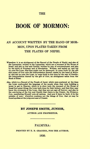
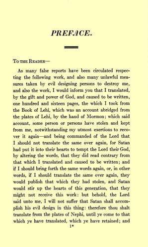
I had never been involved in the matter and I had never seen the original setting. But soon after the Conference, Louis Crandall sent to me Xerox copies of the original document with a plea for help in coming up with an accurate typographic facsimile. He emphasized that he would stand for nothing less than movable type! No photoengravings would be tolerated.

Several persons had studied the original previously, and had concluded that Lanston Monotype’s Scotch Roman would be a close match to the original font utilized. But this wasn’t working well because the “set” of the Lanston face was wider and thus, it was impossible to match the original document in a line-for-line fashion.

I did my own casting in Scotch Roman casting it on a narrower set body and reducing word spacing, but it still didn’t work well line-for-line. Also, the setting revealed to me that Scotch Roman was a very poor match to the original.

I studied both English Monotype and Lanston Monotype specimen books closely; there was nothing in the green vinyl English book. I was more fortunate with my Lanston specimen for my copy included samples of most of the very early Lanston designs. Lanston did many “Modern Roman” designs between 1900 and 1930. The firm was trying to lure to its equipment numerous magazines and did many closely similar faces in an effort to mimic perfectly the hand-set faces utilized by these magazines. I happened upon 10 pt. Modern Series 34; it seemed most promising. Its set was a full half point narrower than Scotch because it was a trifler smaller on the body. But I didn’t have these mats. The beauty of our American Typecasting Fellowship came to my rescue. E-mail inquiries revealed that Jim Walczak had not only the Modern Series 34 mats, but also 12 pt. Masterman mats, which I had determined to be a close match to the chapter headings in the original. I also determined I needed 10 pt. Law Italic to assist in matching an italic used at the beginning of each chapter. Greg Walters of Piqua, Ohio, came up with this font of mats. Thus, I located mats for everything I needed—a surprising fete considering all the matrix fonts I had selected were likely to be over 80 years old!

When Jim’s mats arrived, I went back to my keyboard and re-keyed the page in Modern Series 34, “squeezing” the face to 9 1⁄4 set. To my amazement, every single line fit with no special effort, making the whole project far more manageable at the keyboard.

What you cannot see is the uncanny closeness to the original demonstrated by this design. Lewis Crandall provided an acetate transparency of the page in question, and upon laying it over my proof, everything was “right on.” The only variation was that my word spacing across each line was even, where it was erratic in the original (as always is the case with hand composition). The original page was about five points deeper (less than half a point per line) giving evidence that the original font was not cast to the American Point System, which didn’t come into play until about 1880.

Greg’s font of Law Italic provided swash caps M, N, A and punctuation (which had more pronounced tails and slopes, especially comma, apostrophe, and semi-colon). The face’s odd-ball ampersand also was a very good match. However, Law Italic did not match the original at all with regard to most other lowercase characters, especially the g, f and its ligatures. So I hit upon the idea of dropping a few Law Italic matrices into the 10 pt. Scotch Roman Italic font. I chose Scotch over the Modern Seires 34 Italic, for the italic in the original text appeared more closely matched to the Scotch Italic. I took the chance of dropping in a few Law Italic mats knowing that all early Lanston faces were manufactured to the same alignment. To my delight, the trick worked and worked well. The slope of the Scotch Italic isn’t as great as the Law Italic, but few would recognize this variance. Again, I was able to match the setting precisely, line-for-line. Indeed, the italic material was set with what I consider excessive word spacing in many instances, but my goal was to match the original in every way.

Lou Crandall’s goal was to have a 16-page signature of the Book of Mormon locked up in his authentic press at the Museum. Here Rich is reviewing several of those 16 pages.

I demonstrate the first page of the First book of Nephi to show this italic composition. My Masterman font matches the shape and feel of the caps used in the original, though Masterman has a wider set and is a trifle bolder.

Matching text in metal (which was composed far before the Monotype was invented) was a very difficult task. But this endeavor proves that with a little luck, help from friends, and a bunch of study, it still might be possible. It’s to the Crandall Museum’s great credit that there was insistence upon using movable type in its exhibit press. Even the Gutenberg Museum in Germany uses type-high electros and seems not all embarrassed about it.

Finally, there was one line of type for the heading “Preface.” It was a distant relative to Ultra Bodoni Italic. I determined it was what they called a “fat face roman italic,” which was quite popular in type specimen books dating back to the early 1800s. But such a design never was cut into matrices for the Monotype. I e-mailed a proof of that word to Stan Nelson at the Smithsonian Institution in Washington, D.C., asking him if he might have a match for the font in his historic holdings. To my delight, he replied that he had a virtual perfect match and he volunteered to cast the necessary letters utilizing his 16 point hand mold. Later he confessed that the extreme thin lines of the face were very difficult to get to fill properly in the process of hand pouring into the hand mold. But with numerous rejects tossed aside, he did succeed. In turn, I had to utilize my handy Rouse Type Mortiser to better fit Stan’s casts, and I utilized my modified Ludlow Supersurfacer to mill Stan’s over-type-high casting to .918’’ and match all my other Monotype work.

There was a lengthy legal notice on the title page and its verso side which utilized a tiny 6-point letter, which I found to closely match another Monotype “Modern Roman,’’ the very popular Modern No. 8. Therein was a single 14-point initial letter B. I cast from four separate fonts before concluding that Century Schoolbook Bold was the closest match to the original. So, with all these machinations, I was able to match in hot metal the faces and typography of every letter included in the original document— nearly 200 years after the original document was hand composed utilizing early foundry type.