If ever there was evidence that I am a genuine “type nut,” this story certainly should suffice. I have several stands of cast type in typecases throughout my basement. Better still, I have a few thousand fonts of typecasting matrices for making type and I have the equipment necessary. But with such a treasure trove on hand, would I venture to buy type anyhow?

Well, yes. Most recently I have been leaning toward Victorian revivals—type designs which were created before the beginning of the twentieth century. Yes, I can cast perhaps twenty or thirty of these gems from my own matrices, but when I see a Victorian come up on the market, my toes begin tingling just the same.

So it was early in 2020 an on-line auction showed three parcels which I identified (from the pictures) that they all were 48 pt. P. T. Barnum, cast by American Type Founders. Well, I like the face, fair enough? So I have matrices for casting the font, so shouldn’t I just go to the shop and start casting? In case you don’t know it, doing such a thing would consume a lot of effort and at least two days at the casting machine. I figured if I won the bids for $20 to $40, I would be ahead of the game and at my age, taking the easiest path definitely is my mode of operation.

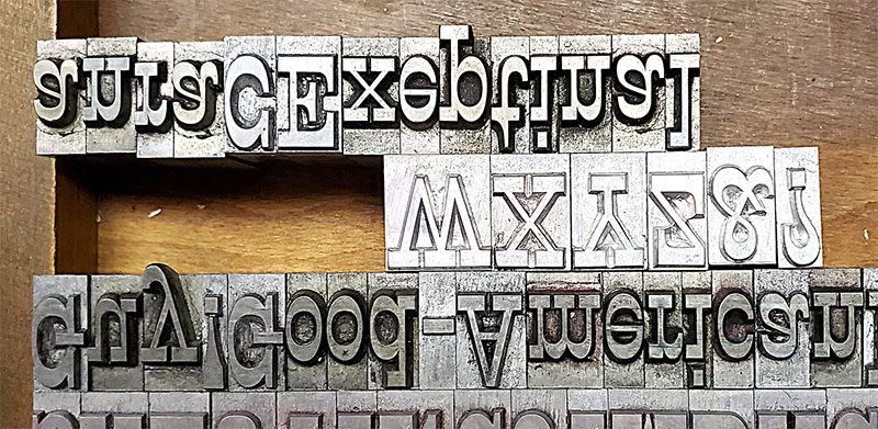
So my bids went in on the three packages. Two packages contained the caps, figs, and points. The third package contained the lowercase only. Shouldn’t the auctioneer have listed the three as one lot? Of course, but who is to tell an auctioneer how to list stuff? So it was that I won the bid only on the lowercase. Some other guy got a cap font that he could use. I got a font of lowercase which would be practically useless without caps, etc. So my font of lowercase arrived and immediately I was in love with it. I love the feel, look, etc., of type, especially large type cast by ATF. Oh, it’s gorgeous. So what to do?

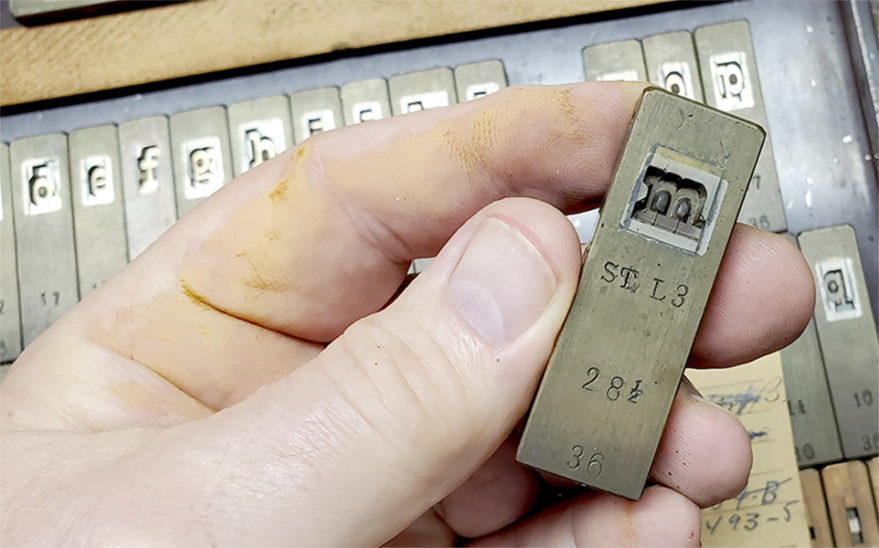
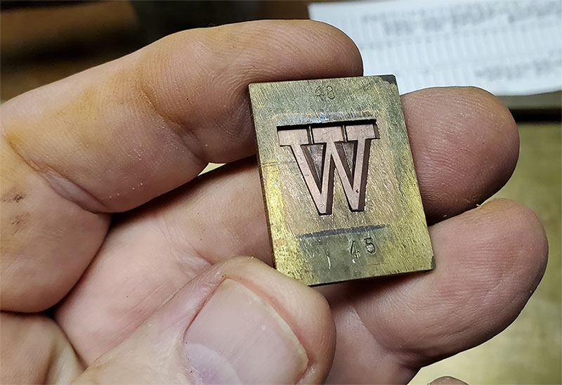
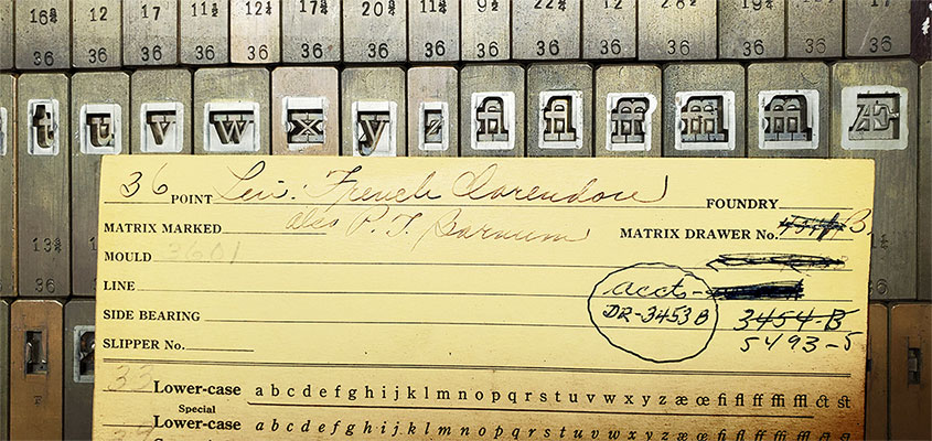
Somehow my “bucket list” got rearranged and I was heading for the basement typefoundry to seek out the matrices and get a casting project underway. I have over a hundred fonts of matrices which came direct from American Type Founders at the auction of ATF in the 1990s, but P. T. Barnum was not in that lot. But later on another person who did acquire P. T. Barnum opted to put his mats into my safekeeping. I was intending to cast my stuff from the very same mats used for the casting which I had lost the bid on. But to my disappointment, I found I have 18, 24, 30 and 36 point only. Somehow the larger (and smaller) sizes were not in the lot, so my story is about to end? Not quite.

A foundry-style matrix from American Type Founders(Left). A “flat matrix” for the Thompson caster made by triangle Type Foundry(Right).

I also long ago acquired about 100 fonts of Victorian fonts, the matrices having been made by the Triangle Type Foundry of Chicago. Victorian fonts (essentially fonts designed and marketed before the twentieth century). The folks at Triangle were climbing aboard the revival fad and had their own electrdepositing capabilities, so they made their own matrices from both original sources and from type made by Typefounders of Phoneix, which had pioneered the revival. Triangle did have 48 point P. T. Barnum. 

Everything has a story and so it goes for P. T. Barnum. Mac McGrew’s book American Metal Typefaces of the Twentieth Century, says ATF revived the font in 1933 and again in 1949, utilizing matrices in their archive from the Marder, Luse & Co., foundry of Chicago, one of the several foundries which were merged together to form ATF at the end of the nineteenth century. Mac also says that the font originally was called French Clarendon. That information is confirmed by the font card which accompanies my 36 point font. ATF renamed it P. T. Barnum and just scratched out the original name on the card. So when did French Clarendon originate?  I don’t have ML&Co specimen books so I can’t confirm, but I am fairly certain the font originated before the American Point System was introduced.  ML&Co was a driving force behind that innovation, starting in the 1880s. Prior to the point system, each foundry made its type to its own standard and in this case, the four-line pica type made by ML&Co was larger than the four-line pica type made by MacKellar, Smiths and Jordan and other founders, whose bodies more closely resembled the new point body standards.

Original font card accompanying the 36 point matrices from ATF with original name marked out.

So how do I know this? Well, when the point system was adopted, it required that every font manufactured would need to be redrawn to precisely fit the newer, and in this case smaller bodies mandated by the point system. This involved a tremendous amount of time, money and effort and was not quickly accomplished. As an intermediate solution, on many faces typefounders chose to stay with the original matrices, and just let them overhang the smaller point bodies. That is the case with P. T. Barnum. The design really is about 54 points tall, as evidenced by the lowercase descenders, which hang off the body about six points. So are the matrices I have from ML&Co? I can’t be sure, but it is likely.

Descenders hang off the bottom of the body. All caps in this photo are from my casting. The WXYZ&? have never been inked.

Back to the casting effort. I pulled the Triangle mats and did the work on my Thompson. Did my work match the ATF originals perfectly? Well, not exactly. The lowercase letters from ATF don’t quite fit into the Triangle matrices, suggesting to me a very slight shrinking in size which may have been precipitated by more than one effort over the years to electrodeposit the mats. But not even a person with a microscope could see that variation. The only way one could detect my work compared with that of ATF is that my type bodies have a smaller nick and the nick is higher on the body than ATF’s. Finally, the Triangle mats are to the Monotype standard of .050” drive. The ATF mats have a deeper drive, meaning the letters face-to-shoulder stand higher on the bodies than my casting. (The total height of .918” is the same on both.)

The heading above was composed from the mixed font now in my shop. I defy anyone to see anything different with the combination. Now I have a super-abundant font of caps to work with my dinky font of lowercase. Already I have needed to do sorts of the lowercase, but that’s no real big problem. Making your own type does have its advantages!

Hip Hip Horay!