Paul Duensing is a legend in the private press/private typefounding arena, having been “bitten” by the concept In his early youth. His personal affable nature coupled nicely with his professional employment with the Upjohn pharmaceutical company, which took Paul to numerous locations both in Europe, the U.K., and across the United States. I first came in contact with Paul in the mid 1960s. Paul visited my home several times in the 1970s when Upjohn obligations took him to Seven Springs, Pennsylvania, not far from Terra Alta, West Virginia. By that time I had my own typecasting equipment and for some reason, his Thompson caster was not operational. So when he visited, he always had a hand full of matrices he had engraved for which he needed to cast and proof for approval and/or further development.
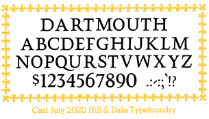
Along came an E-mail inquiry in June 2020, asking the whereabouts of a proprietary typeface called “Dartmouth.” It was the kind of inquiry which delights my own curiosity and thus, I jumped at returning an answer.
The inquiry came from Won K. Chung, who teaches a letterpress typography workshop at the Dartmouth College Library. Jumping far ahead, I later was told by Won that he read about the design in The Private Typecasters, a book I had edited for Henry Morris at his Bird & Bull Press. The book was published in 2008.
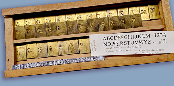
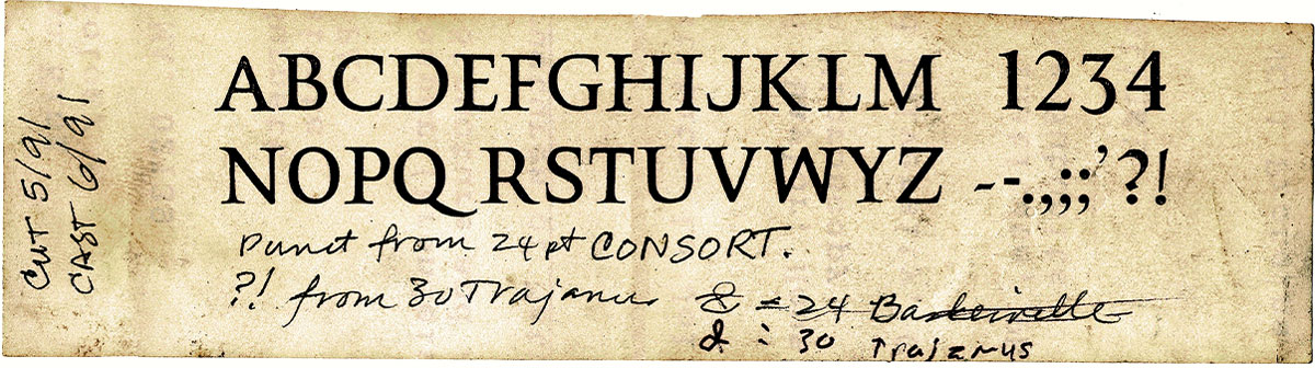
Engraving of matrices for the font was carried out by Paul Hayden Duensing in May and June of 1991, being the last work of this kind being undertaken by Duensing at his Kalamazoo, Michigan, home before he and his wife Ginger sold their home, placed all their belongings in storage, and departed for what ended up being a full year of adventure in Germany and Europe.
Won Chung later revealed that “Part of my interest in all this is to help preserve the Will Carter legacy at the college and that of Ray Nash’s Graphic Arts Workshop which he created in 1937. Until reading the piece in The Private Typecasters, the Duensing experiment with a typeface he chose to call “Dartmouth” was unknown at that institution, although it is now evident that a publication called Carter’s Caps with specimens printed from wood blocks done by Carter are most likely the same models provided to Duensing for his matrices.
So in capsule form, that was the background on the Dartmouth design. More details will evolve as this story unfolds, but for the present, I will delve into “relationships” in an effort to explain how the matrices came to rest in my collection at the Hill & Dale Private Press and Typefoundry.
Paul was a pioneer “private typecaster” and he definitely was my mentor, advising me before I acquired any typecasting equipment. Paul struck up similar acquaintances wherever he traveled and therefore was very familiar with many individuals in the trade across the globe. The fact that he was a linguist (I believe he had mastered seven different languages) facilitated acquaintances. Will Carter certainly was one of the people he had come to know. When I came up with the idea of getting private typecasters together in some sort of “conference,” Paul was the first person I asked to work with me in the project. That became the American Typecasting Fellowship, which first met in Terra Alta in 1979. Subsequently, in an effort to further expand knowledge and familiarity with typefounding, I launched (with Paul’s full participation) Monotype University, with sessions being held semi-annually for about 14 years.
The July 1999 session included a student named Mike Anderson, who was semi-retired at the time and had only recently taken to typefounding like ducks to water. Eventually Mike gathered a shop of some significance, and undertook nearly all aspects of typefounding including matrix engraving, electrodepositing, and (of course) casting, especially with his Thompson casting machine. Mike’s great enthusiasm and quickly expanding knowledge of all aspects of the trade caused me to ask him to “join the Mono U faculty” and thus, he, Paul, and I came together frequently (with other faculty members too) for these Mono U sessions. Of course this all occurred after Paul and Ginger had returned from Germany and settled in Watkinsville, Georgia. Our “hobby life” was great and we played off each other very well during those years. Then Paul was diagnosed with Parkinson’s disease and because of his medical familiarity, he was aware that eventually, the disease would take his life. So Paul began a studied effort to dispose of his equipment. He presented various things to me as gifts (such as his ornament matrix collection). Lynda and I visited Watkinsville on a few occasions. I cannot recall why Paul and I did not discuss the idea of my acquiring some (or all) of his equipment. By that time, I had a substantial collection of my own. But perhaps it was my not too subtle way of pushing aside thoughts of Paul’s eventual passing. Mike Anderson had a far better grasp of the situation, so he negotiated with Paul and eventually took possession of most of Paul’s matrices. That includes all of Paul’s proprietary work, such as the Dartmouth design and Herman Zapf’s Civilité design. Mike was an enthusiastic person and brilliant, too. With that being said, his skills at organization and orderliness were sadly lacking. No one really knew what he had, or where it might be if he did have it. But as long as Mike was around, it wasn’t a pressing problem. He knew where everything was. One afternoon I got a call from Mike asking me to come to his home at Port Republic, Maryland. He announced, “I’ve got cancer and it’s going to progress rapidly.” Even though Mike and I didn’t live that far apart, one had to traverse the entire metropolitan region of Washington, D.C., to get to his place and that made it a 5- to 6-hour trip. Nevertheless, I went to see Mike. He wanted me to take charge of the disposal of all his machines and matrices and I agreed. While he was still able, he tried to show me where things were and what they were, but in truth, it was a “jumble.” For example, he had a Composition Caster but never was able to get it running properly. When we came upon composition matrices, he pulled them off the shelf and handing them to me as a “gift” saying, “ I never ever will use any of them.”
Our agreement was simple enough. After his funeral I would go through the shop and remove anything and everything that related to matrices. I would haul it all to Terra Alta and do a complete inventory. That inventory work took over a year to complete because nothing was well marked as to what it was, and most of it was Paul Duensing’s proprietary stuff, not to be found in any catalog. I then conducted a sale “on line.” The sale was quite successful and the sale bill itself serves as a good reference for future generations to know the great variety of Paul Duensing’s typographic interests. Conducting the sale was, I confess, one of the most stressful times of my entire life.
Mike allowed me to put aside anything which I particularly liked, in exchange for my doing this service. It was at this point when I laid aside the Dartmouth matrices, along with other fonts. They were unique and nicely boxed in a slide-top wooden box which Paul told me had been made by his father several years before.
Thus, acquisition of the Dartmouth matrices was just a “whim” on my part. I did not know who did what and when. The information found in Private Typecasters must have been given to Mike verbally during his various visits to Paul’s home as he acquired the equipment. This “ignorance” will come into play as I began work in casting fonts for Won Chung. I didn’t know whether I was casting to match work done by someone else. There was no instructional material with the matrices other than several cast specimens and a single slip of paper—a proof made by Paul Duensing with his handwriting giving some details. I shared this dilemma with my friend David MacMillan and he found a very helpful reference written by Paul Duensing titled “Contemporary Private Types” in a book called American Proprietary Typefaces. edited by David Pankow and published in New York by the American Printing History Association in 1998. Therein, Paul says:
In the 1980s I acquired a set of composition matrices for Monotype Octavian, designed by Will Carter and David Kindersley. I soon felt the need for compatible titling caps and first tried cutting a larger size of the Octavian caps. These clearly did not work and were never meant to be a titling letter, as Carter pointed out when I showed him a proof. In 1991 he allowed me to cut the Dartmouth caps which were designed by him for that purpose. No fonts have been sold.
So there you have it. No fonts were sold and the matrices were made by Paul Duensing for his own private use as a display letter to accompany English Monotype’s font called Octavian. Will Carter had done the drawings for that purpose but there seems to be no other formal contact with the college. I wish I had done this research prior to starting the casting project. I wished I had all letter samples to guide me, and/or a listing of intended set widths. The samples in the box didn’t seem to be consistently cast as to set width. Since all letters were engraved, they all carried beards which likely should be dressed off to allow tighter setting, as has been customary in typefounding for centuries.
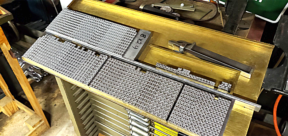
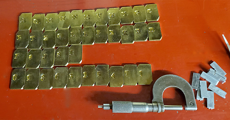
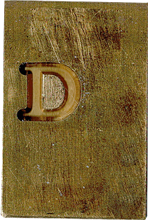
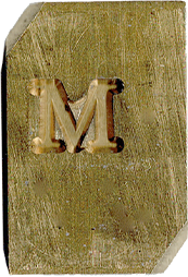
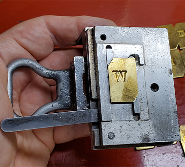
The observation just made regarding beards told me I needed to do my casting on the English Supercaster rather than the Thompson. Thompson casting is greatly impaired when letters are cast on bodies narrower than the image itself. So my first step was to modify Paul’s matrices in two ways: (1) his mats were approximately 1/16 inch wider than standard Lanston mats, and (2) they needed to be chamfered in order to be held properly in the standard American matrix holder made for the Supercaster. Shown below is one matrix before chamfering, and a chamfered matrix in the matrix holder.
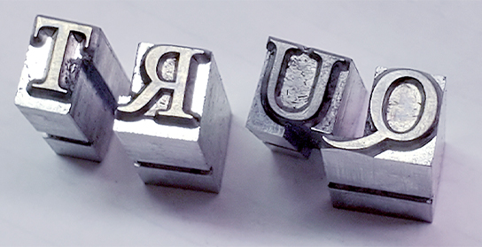
The Thompson delivers cast characters held tightly in a row while the foot is plowed and the top and bottom edges of the face are trimmed. This forces the letters together and distorts or breaks off any overhanging portions—in this case the overhanging beards. The Supercaster delivers each letter individually and therefore does not break or distort any overhangs. However, it must be noted that to accomplish this, every single letter needed to be hand-dressed to eliminate the overhanging beards. The sample below shows the overhanging beard of the tail of the cap Q as an example of why dressing was necessary. This slowed the casting process immensely. Commercial matrices nearly always were made with dressing built into the product.

The beards on this Q must be trimmed flush with the body’s edge on top, bottom and left of this letter. The tail is allowed to kern partially on the right edge. This is called “dressing” and, unfortunately, the work must be done by hand.
My rationale of casting my letters tightly was that if space needed to be added, a brass or copper thin space would do. Reducing the width of a cast character is far more difficult to do.
Paul Duensing was not above “make do” solutions to problems, especially since he wanted these matrices only for his personal use. He tolerated deficiencies which became evident as casting progressed. My first discovery was that nearly all the matrices were engraved “out of square,” meaning many letters “lean to the right.” This is an indication that either his pattern or his matrix blank was “out of square” when the engraving work was done.
Correcting this problem with the equipment on hand would have been nearly impossible. One letter especially, the “I,” was badly “out of square.” Make-shift modifications were attempted. However, the letter also was engraved far too close to the left edge of the matrix, meaning damage might occur if too much “fiddling” was attempted. Therefore, it remains slightly cockeyed.
As indicated on Paul’s note shown above, punctuation marks were not included with the engraved matrices. Paul’s note says he used Consort punctuation. He did have matrices for that font so he could cast those items. However, he also noted that he used 30-point Trajanus for the ? and ! That was an imported type font and Paul had to electroform matrices for those characters. Unfortunately, those special matrices were not included with the font. I spent much time searching for a good match and settled on 24 pt. Goudy Lanston for all characters. Unfortunately, I did not have 30 point mats, so my ? and ! are too small. Long after the project was completed and delivered, I discovered quite by accident an electrodeposited matrix of the ? mark which was totally out of place and my identifying it was only possible because of my familiarity with the project. I have not yet cast it, nor have I found the ! Which likely also was done.
Apparently Will Carter did not do figures. So Paul asked his friend from Toronto, Will Rueter, to do drawings “in the spirit” of the alphabet. It’s obvious to me that these came later. Though they are aesthetically pleasing, they don’t truly match the font mechanically. The letters “fill the body” top to bottom, meaning they’re nearly 24 points tall. Therefore, the figures will not align with the alpha characters, if they are combined within a line. Paul’s markings indicate the alphabet is 22 point, but the fact is that with the descending Q requiring a lower shoulder, the letters properly fill a 24 point body.
At this point I must inject a bit of knowledge of what was going on in Paul Duensing’s life during the time this project was being pursued. Paul had recently retired and he had been presented with the opportunity of a lifetime—managing a major new printing museum being assembled at Darmstadt, Germany. He and Ginger made the decision to sell their home, put all belongings in storage, and head for Germany with some sense of urgency.
Paul obviously sought to complete the Dartmouth project but he also was rushed with countless other distractions at the time. This, in my mind, is the major reason for the mis-sizing of the figures and other deficiencies I have found in Paul’s work. Since there was no “customer” pressing for delivery, or any other major reason why he could not put the project “on hold,” Paul completed the work sufficiently to provide preliminary proofs. He could return to the project sometime in the future, if and when he and his wife either returned from Germany or had household goods forwarded to them in Germany. Apparently it was his project alone, and Dartmouth itself was not much involved in its execution.
In the old days, typefounders spent weeks discerning exactly what amount of white space was needed on the left and right edges of each letter. Even still, the best designed piece would require adding and subtracting white space to make a line of words appear to flow properly. Clearly that adjustment was not done during this experimental casting. Therefore, we must rely on the careful attention of compositors when using this casting, adjusting white space as necessary.
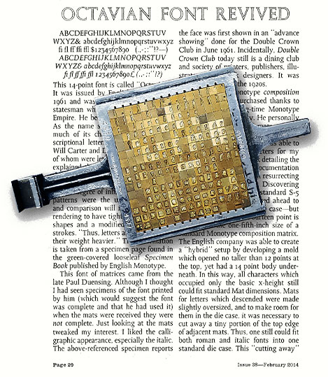
As mentioned earlier, Paul’s acquisition of Octavian matrices from English Monotype precipitated his interest in having a “matching” font for display. Also as mentioned earlier, in the wake of Mike Anderson’s disposal of equipment, a bunch of loose English Matrices was handed to me in a box. Back home, I sorted everything out and discovered among other things that I had a near-complete font of matrices for 14 point Octavian. Some matrices were missing and I had no paperwork indicating matrix case arrangement, etc. With the help of Duncan Avery at the Type Trust in London, I was able to acquire necessary paperwork and Duncan was able to make for me the missing matrices. All this was accomplished before I had any knowledge of the relationship of Octavian with Dartmouth.
I put in a lot of effort to get the matrix font set up and ready for composition but that was completed and a specimen of my work appeared in ATF Newsletter 38 (February 2014). I have just pulled out the matrices and as time allows, I will convert my American Comp Caster to handle these English matrices again and I will revisit the relationship between Octavian and Dartmouth. Hopefully, if that effort is successful, Paul Duensing’s original goal will have been accomplished.